Way-finding / Info Design
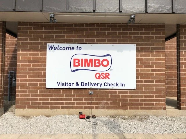
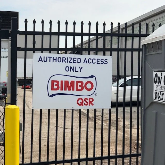
Bimbo QSR
Bimbo QSR
For Bimbo QSR’s Chicago-based production plant, we designed and implemented a clear and effective wayfinding signage system using the company’s iconic logos and brand colors. The goal was to improve navigation, safety, and efficiency within the facility while maintaining a strong brand presence.
The signage was strategically placed throughout the plant to provide easy-to-read directional guidance for employees, visitors, and deliveries. Using bold typography, high-contrast colors, and recognizable brand elements, the design ensures quick comprehension and seamless movement throughout the space.
This project successfully enhanced workplace organization, reinforced Bimbo QSR’s brand identity, and created a more navigable and efficient production environment.
Ascension Health
Ascension Health
For Ascension Health (formerly AMITA Health), we designed and implemented a comprehensive wayfinding and informational signage system across all hospital locations. The project focused on creating clear, branded, and highly visible signage to support COVID-19 protocols and operational navigation throughout the facilities.
Utilizing Ascension’s branded colors and design guidelines, signage included informational displays for health protocols, visitor guidelines, and sanitation measures for COVID-19. Signage also included way-finding solutions to improve navigation for patients, visitors, and staff across multiple departments and entry points.
This project successfully enhanced hospital navigation, reinforced health and safety messaging, and improved overall patient and visitor experience within Ascension Health’s facilities.
TI Communities
TI Communities
For TI Communities, we designed and installed custom outdoor signage, including a recreated site map tailored to each apartment complex’s unique color scheme and branding.
The project focused on enhancing navigation and visual consistency by incorporating branded colors that seamlessly matched the identity of each property. The newly designed site map provided a clear and easy-to-read layout, ensuring residents and visitors could efficiently navigate the community. Using high-quality, weather-resistant materials, the signage was built for durability and long-term visibility.
This project successfully improved way-finding, reinforced the brand identity of each apartment complex, and elevated the overall aesthetic of the properties.


